
Tuesday, December 7, 2010
Set Apart For An Instant
Share
 "Set Apart For An Instant" If I could choose a super power it would be Invisibility. I am a rather socially awkward person and am much more comfortable observing over participating. A lifetime of observation has left me with some favorite moments. Not necessarily individual moments (though there are some great ones!), but moments we share without knowing. We are all guilty of masking our true feelings; especially, it seems, from those we care about most. This painting captures that moment of true emotion just before the smile-for-the-world covers it up.

Monday, November 22, 2010
Convergence
Share
 "Convergence" Behind the tidiness of converging lines there is a freeform textural element; the grid of lines represent our interactions within society while the swirling element underneath represents the chaos and turmoil that lurks just beneath the surface in all of us.
Or, ya know, something like that...
One of these days I'll be comfortable talking about my abstracts and won't sound like such a dork when I try to explain them. For now, you get this!

Or, ya know, something like that...
One of these days I'll be comfortable talking about my abstracts and won't sound like such a dork when I try to explain them. For now, you get this!
Monday, November 15, 2010
Odette
Share
 Here she is... the completed "Odette". (See the making of her here.) To finish her off I put a glaze of Burnt Umber over the whole thing in a very haphazard fashion. This helped even out and tone down the colors and gave it a richer, almost "antiqued", feel. You can't see it in this picture but the edges of the canvas are beveled and painted a dark brown-black that has been feathered into the painting. The effect is like torn paper edges, as if the portrait was taken from a larger picture or torn from an old scrapbook. When I was done with her I stood back and asked aloud, "So, what's your name?" Odette was the name that popped in my head so I took that as her answer.

Sunday, November 14, 2010
The Birth of "Odette"
Share
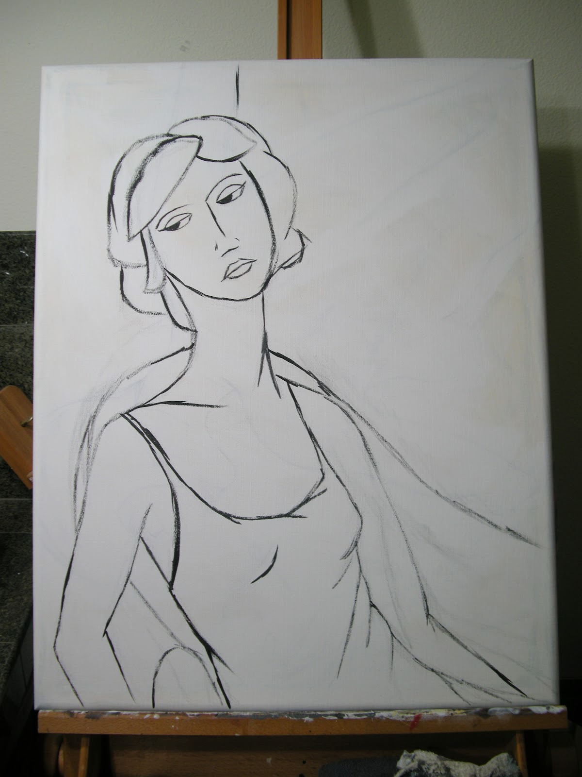
I always enjoy watching and learning from other artists, so I've decided to share a bit about the process that goes into my painting. I don't use the same method in every painting; partly because the desired outcome can determine the method used to get there, and partly because I like to experiment. I say, "I wonder what would happen if I...." a LOT! I just finished a painting of a woman called "Odette" and took pictures at the end of each major step in the process. Here goes...
 The first step is a rough sketch. I use this to map out body position and, to some extent, the light and shadows. I don't like to plan too much in a painting as I much prefer to throw general ideas out and see where they take me. I don't usually keep sketches since most of them are done on the backs of recycling on their way to the bin.
 Next I sketch it out on the canvas (or whatever) first lightly in pencil, then in thinned black paint. I'll add or subtract elements at this point, such as the chair and wall corner seen here. At this stage I like to have the basic premise worked out but I'm still pretty non-committal about everything from color to details.
 After that I put in the shading, I limit it to about 2-3 shades of gray plus basic black and white. This is a pretty important stage in the game. On the one hand, every single thing you see here will get covered in another few layers of paint. On the other hand, most of it will show through to some extent so it needs to be on target. This is usually where I start thinking of what colors to add where. I rely heavily on intuition and whim when making those decisions!
 I like to keep my palette pretty limited so the whole piece feels congruent. I like a lot of contrast but find too many colors to be distracting. This, of course, is purely personal preference. When I looked at the expression on this woman's face I felt it showed a bit of sadness, a bit of boredom, and a bit of resignation. It called for cool, subdued colors so I chose muted purples and greens. Both background colors and her dress are all from the same base color, the differences were achieved by adding white or dark brown. You can see how the shading from the previous step is showing through this first layer of color.
 This next step involves more color, usually just a second layer of a shade similar to that applied in the previous step. This is where I start adding in some of the lines lost after the first step. I do a lot of outlining and a lot of general scribbling to finish my work. I want those to be (and look) deliberate so they have to be applied toward the end.
The last step means it's finished.... and I'm not going to show that here! You'll have to check out the next post to see the completed "Odette"!
I always enjoy watching and learning from other artists, so I've decided to share a bit about the process that goes into my painting. I don't use the same method in every painting; partly because the desired outcome can determine the method used to get there, and partly because I like to experiment. I say, "I wonder what would happen if I...." a LOT! I just finished a painting of a woman called "Odette" and took pictures at the end of each major step in the process. Here goes...


The last step means it's finished.... and I'm not going to show that here! You'll have to check out the next post to see the completed "Odette"!
Saturday, November 13, 2010
Manteca
Share
 "Manteca" When I paint abstracts I go in with no preconceived ideas of the outcome: not the shape, the palette, the story, nothing. It is simply to satisfy a primal need within my being to paint. Sometimes when I'm done I can see certain emotions or thoughts worked out on the canvas, and sometimes I just see colors and shapes that are pleasing to me. It's interesting to see how the image changes when turned this way or that and determining which way is "UP". When I was done with this one it seemed undeniably landscape-like - even though I typically can't stand landscape paintings. I decided to give it the name of an actual place and went with the first name I came across, thanks to a bottle of Gnarly Head Merlot made in Manteca, CA. And it was deee-licious!

Wednesday, November 3, 2010

Subscribe to:
Posts (Atom)