
Tuesday, December 7, 2010
Set Apart For An Instant
Share
 "Set Apart For An Instant" If I could choose a super power it would be Invisibility. I am a rather socially awkward person and am much more comfortable observing over participating. A lifetime of observation has left me with some favorite moments. Not necessarily individual moments (though there are some great ones!), but moments we share without knowing. We are all guilty of masking our true feelings; especially, it seems, from those we care about most. This painting captures that moment of true emotion just before the smile-for-the-world covers it up.

Monday, November 22, 2010
Convergence
Share
 "Convergence" Behind the tidiness of converging lines there is a freeform textural element; the grid of lines represent our interactions within society while the swirling element underneath represents the chaos and turmoil that lurks just beneath the surface in all of us.
Or, ya know, something like that...
One of these days I'll be comfortable talking about my abstracts and won't sound like such a dork when I try to explain them. For now, you get this!

Or, ya know, something like that...
One of these days I'll be comfortable talking about my abstracts and won't sound like such a dork when I try to explain them. For now, you get this!
Monday, November 15, 2010
Odette
Share
 Here she is... the completed "Odette". (See the making of her here.) To finish her off I put a glaze of Burnt Umber over the whole thing in a very haphazard fashion. This helped even out and tone down the colors and gave it a richer, almost "antiqued", feel. You can't see it in this picture but the edges of the canvas are beveled and painted a dark brown-black that has been feathered into the painting. The effect is like torn paper edges, as if the portrait was taken from a larger picture or torn from an old scrapbook. When I was done with her I stood back and asked aloud, "So, what's your name?" Odette was the name that popped in my head so I took that as her answer.

Sunday, November 14, 2010
The Birth of "Odette"
Share
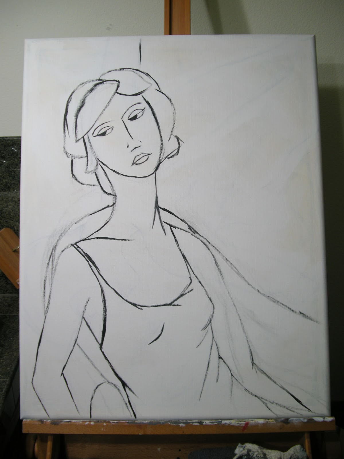
I always enjoy watching and learning from other artists, so I've decided to share a bit about the process that goes into my painting. I don't use the same method in every painting; partly because the desired outcome can determine the method used to get there, and partly because I like to experiment. I say, "I wonder what would happen if I...." a LOT! I just finished a painting of a woman called "Odette" and took pictures at the end of each major step in the process. Here goes...
 The first step is a rough sketch. I use this to map out body position and, to some extent, the light and shadows. I don't like to plan too much in a painting as I much prefer to throw general ideas out and see where they take me. I don't usually keep sketches since most of them are done on the backs of recycling on their way to the bin.
 Next I sketch it out on the canvas (or whatever) first lightly in pencil, then in thinned black paint. I'll add or subtract elements at this point, such as the chair and wall corner seen here. At this stage I like to have the basic premise worked out but I'm still pretty non-committal about everything from color to details.
 After that I put in the shading, I limit it to about 2-3 shades of gray plus basic black and white. This is a pretty important stage in the game. On the one hand, every single thing you see here will get covered in another few layers of paint. On the other hand, most of it will show through to some extent so it needs to be on target. This is usually where I start thinking of what colors to add where. I rely heavily on intuition and whim when making those decisions!
 I like to keep my palette pretty limited so the whole piece feels congruent. I like a lot of contrast but find too many colors to be distracting. This, of course, is purely personal preference. When I looked at the expression on this woman's face I felt it showed a bit of sadness, a bit of boredom, and a bit of resignation. It called for cool, subdued colors so I chose muted purples and greens. Both background colors and her dress are all from the same base color, the differences were achieved by adding white or dark brown. You can see how the shading from the previous step is showing through this first layer of color.
 This next step involves more color, usually just a second layer of a shade similar to that applied in the previous step. This is where I start adding in some of the lines lost after the first step. I do a lot of outlining and a lot of general scribbling to finish my work. I want those to be (and look) deliberate so they have to be applied toward the end.
The last step means it's finished.... and I'm not going to show that here! You'll have to check out the next post to see the completed "Odette"!
I always enjoy watching and learning from other artists, so I've decided to share a bit about the process that goes into my painting. I don't use the same method in every painting; partly because the desired outcome can determine the method used to get there, and partly because I like to experiment. I say, "I wonder what would happen if I...." a LOT! I just finished a painting of a woman called "Odette" and took pictures at the end of each major step in the process. Here goes...


The last step means it's finished.... and I'm not going to show that here! You'll have to check out the next post to see the completed "Odette"!
Saturday, November 13, 2010
Manteca
Share
 "Manteca" When I paint abstracts I go in with no preconceived ideas of the outcome: not the shape, the palette, the story, nothing. It is simply to satisfy a primal need within my being to paint. Sometimes when I'm done I can see certain emotions or thoughts worked out on the canvas, and sometimes I just see colors and shapes that are pleasing to me. It's interesting to see how the image changes when turned this way or that and determining which way is "UP". When I was done with this one it seemed undeniably landscape-like - even though I typically can't stand landscape paintings. I decided to give it the name of an actual place and went with the first name I came across, thanks to a bottle of Gnarly Head Merlot made in Manteca, CA. And it was deee-licious!

Wednesday, November 3, 2010

Simple Step
Share
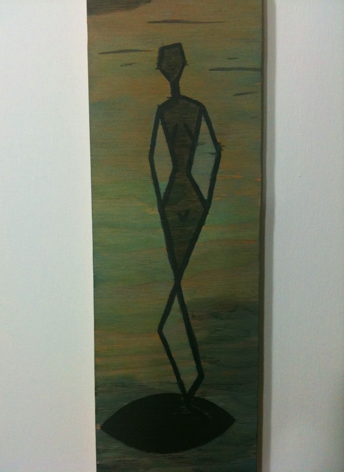
 "Simple Step" This is another bit o' fun with simplifying the human figure. This was done on untreated wood with very thinned paints applied in layers to really allow the wood grain to come through.
Question Of Taste
Share
 "Question Of Taste" I've been experimenting with different ways of simplifying the human figure. This one was done on top of a different experiment in creating textural layered backgrounds. Once I was done experimenting, I thought it looked pretty damn decent as one finished piece. So shhhhh... I won't tell anyone this was an accident if you don't.

Saturday, October 30, 2010
Alone Again
Share
 Sometimes you feel alone because you are, and sometimes you feel alone with someone right there next to you.

Catwalk
Share
 Don't just stand there, let's get to it. Strike a pose, there's nothing to it. Vogue!
This was inspired by fashion illustrations. I'm not in to "fashion" much at all. Kinda just wear what I want to wear and don't follow trends. For the most part I think there have been very few attractive advancements to fashion since the early 60s. That being said, I really enjoy fashion illustrations - yes, even the modern stuff! They're so heavily stylized and often bear little resemblance to the finished product, but I think they're probably a truer representation of what the designer really wants to create.

This was inspired by fashion illustrations. I'm not in to "fashion" much at all. Kinda just wear what I want to wear and don't follow trends. For the most part I think there have been very few attractive advancements to fashion since the early 60s. That being said, I really enjoy fashion illustrations - yes, even the modern stuff! They're so heavily stylized and often bear little resemblance to the finished product, but I think they're probably a truer representation of what the designer really wants to create.
Monday, October 25, 2010

Wednesday, October 20, 2010
Mixing Bowl
Share
 "Mixing Bowl" Digging through the archives, I came across this oldie. This was inspired by a painted tile made a decade ago by a friend. So serene in her kitchen duties - a feeling I certainly can't relate to!

Monday, October 4, 2010

Repose
Share
 "Repose" This is actually a series of three framed mirrors which can be hung as a group or individually. I had these mirrors for months before actually finding the inspiration to work with them. (A common occurrence with my collection of found objects - or "flat surfaces" as I call them.) One day I just looked at them and thought to do primitive paintings of body positions wrapping around the square shapes. They're a bit different from my "typical" figural style but they've had a very positive response. Most people see them as people doing yoga, which was not at all my intention. Now that I think about it, they do rather look like a trio of yogis!

Saturday, September 25, 2010
La Vie En Rose
Share
 "La Vie En Rose" This phrase means "Life in Pink" which is often erroneously interpreted as meaning the same as the American phrase "Looking at life through rose colored glasses". The true spirit of "la vie en rose" is seeing life in a positive way. That life is beautiful. A nice little reminder when it feels like life is letting you down.

Wednesday, September 22, 2010
Enigma
Share
 "Enigma" Until now I haven't really posted any of my abstracts; mostly because I don't really know what to say about them! In many ways these are the most personal paintings I do. I am compelled to paint, need to do it in the same way I need to eat or breathe. Abstracts come out as a natural by-product of life. They come from some deep place in my soul that I can't honestly say I even understand. So I'm letting these out a little now thinking perhaps I can understand them and where they come from.

Sunday, September 19, 2010
Scarlett
Share
 "Scarlett" started with a doodle of hair blowing in the wind. After I was "done" with the painting I decided to add the scarf because she made me think of old-fashioned movies with women flying planes or riding in convertibles - they almost always have white scarves on! My husband named her Scarlett, I assume for the lipstick she's chosen.

Elefanten
Share

I baked muffins with my three-year-old son yesterday. He wanted to wear an apron so I pulled out the one my grandma made for me when I was about his age (he insisted the appliqued "Jamie" actually said "Jude"!). This cute little elephant is inspired by the batik print on my trusty childhood apron. Apparently my camera is color blind as the background is actually pale blue!

I baked muffins with my three-year-old son yesterday. He wanted to wear an apron so I pulled out the one my grandma made for me when I was about his age (he insisted the appliqued "Jamie" actually said "Jude"!). This cute little elephant is inspired by the batik print on my trusty childhood apron. Apparently my camera is color blind as the background is actually pale blue!
Wednesday, September 1, 2010
Going With the Flow
Share
 "Going With the Flow" This was taken from a 60s era photograph of Twiggy by Richard Avedon. It was a very intricate portrait with the light reflecting perfectly off her billowing hair. I wanted to challenge myself to take something that intricate and strip it way down to basic shapes and just a few shades of gray. I finished it off with a coat of polyurethane gloss to bring back in the idea of reflected light. I love how this represents a single moment in time that could never be replicated. The title speaks to those moments you can't control and have to just step back and go with the flow.

Wednesday, August 18, 2010
Discernment
Share
 "Discernment" I often use old/vintage/recycled canvases. Partly for eco-conscious reasons, and partly because they are available for pennies on the dollar - and I do love a bargain. This particular canvas had quite possibly the most ridiculous painting of swans ever executed by someone's dear old aunt. (Aren't all swan paintings done by someone's dear old aunt?) As an homage to the original painting, I used color in a bit more abundance than usual as seen in the blues and yellows found throughout. The title comes from her expression; it's as if she's discerning the qualities of some unseen (to us) item held in her left hand. Hopefully, it's not a swan.

Feelin' Kinda Sketchy
Share
 "Feelin' Kinda Sketchy" came from a drawing that came from a photo of yours truly. Everything you see in this painting was originally intended to be underneath several more layers of paint. I wanted it to be dark with a slightly frantic feel, which is exactly how I was feeling that day: dark and frantic. After I did some very rough shading with black and blue paint, I stepped back and realized the look and feel I wanted was already there! Sometimes you just gotta know when to walk away.

Wednesday, July 28, 2010
The Value of Art in the Community
Share

About a year ago I felt a burning desire to get back into art. It had been a huge part of my life but over the course of time had been put on the back burner. I decided the best way to get back in the game was by taking a drawing class. I researched various venues and ultimately decided on taking one of the adult classes offered at Sixth Street Gallery. I had been there a handful of times and liked the diversity of the art and the fact that it was operated by a non-profit organization. Drawing quickly got me back into my true love: painting. I started posting photos of my finished paintings on Facebook where a few people I had met at the gallery saw them and asked if I would consider joining SSG. I laughed, I said no way, I said wasn't good enough. But the question persisted. After one of my drawing classes, the instructor approached me and said, "The whole board has seen your work. You've been juried in unanimously!" A few weeks later I made the decision to join MOSAIC Arts Alliance and be a regular contributing member of Sixth Street Gallery.
Since then my life has changed, grown, and blossomed in so many ways. I've gained confidence as an artist and as a human. I've now shown my work in six venues around Vancouver, and several in other parts of the Northwest. I've sold paintings and been commissioned to do others. I'm preparing for a featured show in the fall. I feel like the artist within me has muscled her way out of the box she had been stuffed in for nearly a decade. And she's getting bigger and stronger every day! I attribute a huge part of this to the nurturing, supportive community of artists at Sixth Street Gallery.
In an age where schools are phasing out art and music programs because of budget cuts, and big box stores are crushing locally owned stores, places like Sixth Street Gallery become MORE important and MORE relevant to the community. It provides community events and classes that are unmatched by any other venue. I had the great fortune of teaching one of these classes last week. On the last day, one 10-year-old girl said, "I can't wait to take this again next summer!", whereupon the rest of the class chimed in with, "Me too! Me too!"
Here's an interesting fact to put the finances in perspective: Vancouver has over 150,000 residents. If every one of them donated $1 (yes, one measly little dollar!) to MOSAIC Arts Alliance, the operating expenses of the gallery would be paid for the next five years! So, please, if you have enjoyed the artwork at Sixth Street Gallery, if you've taken a class or attended an event at the gallery, or if you've never been but want to help keep the arts alive in your community, make a donation to MOSAIC Arts Alliance. Every dollar really does count, and you never know whose life you could be changing!
Wednesday, July 21, 2010

Thursday, July 15, 2010
A Classic
Share
 "A Classic" Of the many, many things I adore, vintage cars and rockabilly girls are pretty high on the list. Clean, classic, sexy... mmmmm... love 'em! With all the warm weather lately there have been a lot of vintage cars driving around and making me drool. This painting is based on a photo taken by my friend, which also made me drool! (If my photography skills weren't poop, you could see that the painting is also not poop. It's actually quite cute in real life!)

Wednesday, July 7, 2010
But When She Was Bad...
Share

There was a little girl,
     Who had a little curl,
 Right in the middle of her forehead.
     When she was good,
     She was very good indeed,
 But when she was bad she was horrid.
~Henry Wadsworth Longfellow

Thursday, July 1, 2010
Enchanted Gift Shop Logo
Share
 So I've blogged a few times about The Enchanted Gift Shop, a new store and tea room in downtown Vancouver. It's time to do it again - this time because they asked me to design their logo! I had approached them to participate in a local business spotlight in a real estate (my day job) newsletter. I asked for their logo artwork and they told me they didn't have one yet. A few days later they told me some design ideas they had and could I paint it for them? I jumped at the opportunity! First, Gail and Jody are two of the sweetest ladies I've met, and second, it would be a challenging project and I love a good challenge! Painting what someone else wants is very different from painting what you see in your own head. It took a few weeks to get the design perfected, then I painted it in a matter of two days on a huge 3'x4' canvas. It had its debut last Saturday night at a private party for the Democratic Convention that was in town. The design will be worked into all of their advertising and marketing materials and on labels within the store. The original painting is prominently displayed inside the store located at 502 Washington St, Vancouver, WA 98660.

Monday, June 21, 2010
Millie
Share
 "Millie" Like many women of her generation, my great-grandmother worked at the Kaiser Shipyards in Vancouver during the war. She was able to save enough money to buy herself a full-length mink coat - something she had always wanted but never dreamed she would someday own! She wore it almost daily, no matter that it was "too fancy" for every occasion, and when it wore out she had it re-fashioned onto a stole. (Which I now have!) To me she was always a cute, feisty old lady named Mildred. But when I think of her working in the shipyards, saving up for a very girly splurge, she is a cute, feisty girl whose friends call her Millie.

Sunday, June 6, 2010
Cleo
Share
 "Cleo" I was sketching out a woman with a very shaggy, pixie-style haircut but it kept looking wrong. I kept erasing and trying again but it just wouldn't come together! Finally, I did what any sane person would do and I gave up. I flipped the page over and this lady just sort of fell out of my pencil. The trouble was I could still see remnants of the previous lady's hair! I decided rather than try to mask it, I would make the most of the jaggedy lines and just started free-handing jagged lines all over the place which morphed into a sort of abstract foliage-and-floral background. Almost reminds me of stained glass. I dubbed her "Cleo" because her thick black eyeliner is like what Liz Taylor wore in the fabulous 50s era Cleopatra movie. The curlicues in her hair were achieved by using a gloss black paint over matte black paint.

Saturday, May 29, 2010
Now at The Enchanted Gift Shop!
Share
One of the things I love about living and working in downtown Vancouver is all the little locally owned shops. The entrepreneurial spirit is alive and kicking down here! Just a few weeks ago a new shop was added to the mix. Stepping into The Enchanted Gift Shop and Tea Room is like stepping into an old-fashioned English garden party. But the cool thing about this garden party is that you can buy all the gorgeous stuff! And boy do they have some gorgeous stuff! Whimsical handcrafted vases in the shape of dresses, dozens of teas from all over the world, retro inspired aprons, as well as art by local artists like me!

That's right, Gail and Jody (mother and daughter owner/ operators) asked me to sell some of my paintings in there! I'm delighted, honored, and excited to be a part of this great new shop. They're just a few blocks from the Farmer's Market and Esther Short Park so make a point to stop in, have a cup of tea, and shop for someone special - even if that special someone happens to be yourself! They're located at 502 Washington Street in downtown Vancouver. Call 360-693-0650 for business hours and upcoming High Tea service times. Enjoy!
Wednesday, May 26, 2010
Sad Clown
Share


"Sad Clown" is what you'd get if you were able to see my soul. Not trying to be melodramatic here, just sayin' it like it is! This actually comes from a photograph of me around age five. I had gone to a school carnival where, apparently, there was some face painting going on. My mum says she kept trying to get me to smile for the picture but I flatly refused. It's always been one of my favorite childhood photos - I think because it's just so "me".
Above
Share
 "Above" The vast majority of my paintings come from photographs that I've found in books, magazines, or online. I had rescued a stack of magazines from my mum's recycling bin to tear out pictures of pretty ladies. All the pages I wanted to keep were in a stack which, due to my stupor-powers, fell all over the floor. One page was lying on top of another, cutting off the top of a head. I thought the composition was pretty cool that way, so painted it! This one is done entirely with two paints: brown and pthalo blue. All the shading is done through layering the colors using both wet and dry-brush techniques. Fun experiment and I'm diggin' the results!

Tuesday, May 18, 2010
Moonlight
Share
 "Moonlight" is yet another inspired by a 1930s era photo by George Hurrell. As I write this, I can't think of the name of the actress as I had never heard of her. She was quite striking in her full-length velvet cape though! I primed this board with matte black paint then painted her with slightly thinned paints to let the darkness show through. The many, many folds and contours of the cape were a fun challenge!

Wednesday, May 12, 2010
Like My Art? Your Friends Might, Too!
Share
I've been sharing my paintings on Facebook since last summer. I just added their "Share" button on this blog so you can share your favorites with your friends. See a painting you like? Hit the handy dandy "Share" button - et voila - your friends will see what you like. Who knows, maybe they'll remember it when your birthday rolls around! ;-)
I've been sharing my paintings on Facebook since last summer. I just added their "Share" button on this blog so you can share your favorites with your friends. See a painting you like? Hit the handy dandy "Share" button - et voila - your friends will see what you like. Who knows, maybe they'll remember it when your birthday rolls around! ;-)
Monday, May 10, 2010
Harlow

Perhaps the most remarkable thing I learned from that book is that Photoshop is nothing new! The means maybe, but not the result. He (or an assistant) would retouch the negatives with lead to smooth the subjects skin, fix wayward hair, and add highlights and lowlights that couldn't be achieved with lighting alone. One page featured a retouched photo of Joan Crawford beside the original, unaltered print. She had freckles, crows feet, laugh lines, and all the other "blemishes" of life! It made me see the other photos in a different light knowing that they all had received the same treatment. They may as well have been paintings.
Wednesday, May 5, 2010
In Deep

"In Deep" This literally came to me in a dream. I was talking to someone about my new painting and I pointed to a wall where this was hanging. When I woke up I figured I had two options: 1) have the image plague me forever, or 2) paint the bloody thing and be done with it.
Friday, April 30, 2010
Kelsey

Liani

Wednesday, April 28, 2010
Good Morning

Tuesday, April 27, 2010
Beachy

It's Time


Monday, April 26, 2010
Oh, Do Tell!

"A Gracious And Lovely Queen"

MmmHmmmm....

Urban Baby

Nani

Subscribe to:
Comments (Atom)